

The year of reading airmindedly — VII
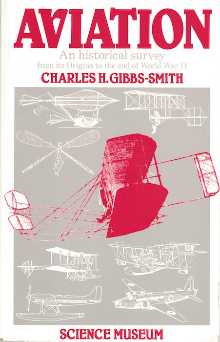
Three aviation history books which have almost no actual flying between them.

Three aviation history books which have almost no actual flying between them.
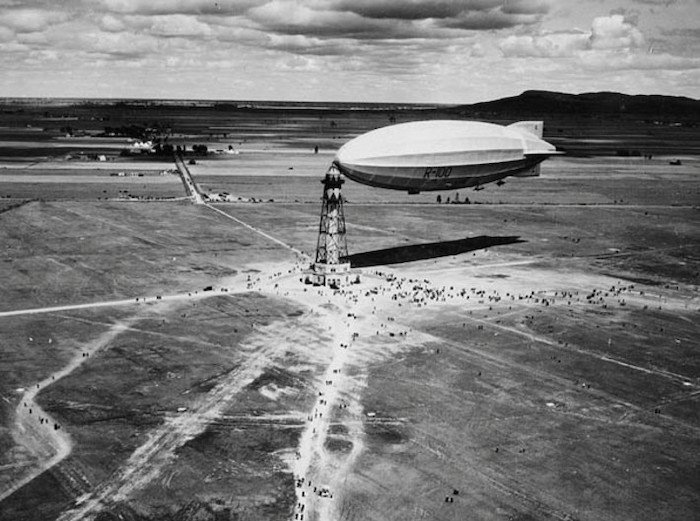
If you’ve ever read anything about the last great British rigid airships, built between 1924 and 1930 as part of the Imperial Airship Scheme, you will almost certainly have come across a statement to the effect that R.100 was known as the ‘capitalist’ airship and R.101 as the ‘socialist’ airship. This was because the former
I think this is a first for this series: three books by past Aviation Cultures presenters!

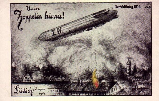
[This review was commissioned by the Michigan War Studies Review back in 2016, but for some reason never got published. As MiWSR is now, sadly, defunct, I guess there’s no harm in putting it up here on Airminded.] James Hamilton-Paterson. Marked for Death: The First War in the Air. New York: Pegasus Books, 2016. Vanishingly
Object history, aircrew history, history for children.
I’m featured in the latest episode of the podcast Tales from Rat City, which is focused on unusual and sometimes bizarre aspects of the history of Ballarat, Victoria’s third largest city (if you’ve heard of the Eureka Stockade, well, that’s where that was). It’s run by David Waldron (a historian at Federation University who co-authored
Bombs, ‘Bomber’, and bombers (among other aircraft).
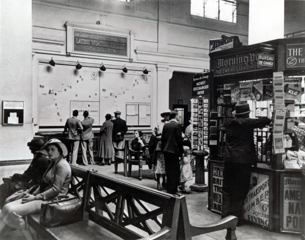
Would you? It’s the summer of 1935.((Late July or early August 1935, judging from the August Popular Flying on display. I can’t quite make out the newspaper headlines but the themes (British troops? American naval policy?) could fit late July.)) You’re at Croydon Airport, waiting to board an Imperial Airways flight to Paris. But you
Group biography, airport architecture, and a campaign history. (If it wasn’t obvious by now, I’m selecting these books completely at random!)
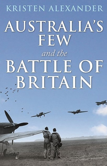
A definite Australian flavour this time, from the Empire Air Training Scheme (as the British Commonwealth Air Training Plan usually isn’t known as) to whatever happened after the Empire Air Training Scheme. Plus the book of a certain aviation history blog (remember blogs? Me neither).