

Nearly four years ago, I wrote a post about a software project Tim Sherratt and I were working on for Heritage of the Air called hota-time. Briefly, the idea was that hota-time would extract and then plot travel times between London and Sydney mentioned in Trove Newspaper headlines, as a quantitative way to gauge the qualitative impact that aviation had on Australian perceptions of distance — or, to be more precise, travel time. We (Tim) wrote the code, proved the concept to our satisfaction, uploaded the project, and then didn’t get around to writing it up for publication. Which we are now remedying… nearly four years later! (The writing, that is, not yet the publication.)
As part of this process, we’ve been cleaning up the data and trying some different visualisations. Here’s one of the more interesting plots.
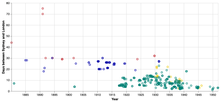
This is an updated version of the first plot in the old post, but instead of just lumping all the data together, it is separated out by colour:
- dark red: sea, present
- indigo: sea, future
- yellow: air, present
- teal: air, future
That is, present travel times are those reported as actually having been achieved, whereas future travel times have not yet been achieved (usually because they are medium or long-term forecasts, but shorter-term schedule changes fall into this category too). So dark red + yellow tracks actual travel times between London and Sydney, while indigo + teal tracks predicted travel times. Or dark red + indigo tracks sea travel, while yellow + teal tracks air travel.
So there are some interesting things to talk about here. Firstly, there is very little sea travel represented here: some scattered points from the 1880s through to the First World War, and almost none thereafter. Conversely, there are a huge amount of data points representing air travel, beginning with the First World War and never letting up until the Second. This seems surprising: even after the first Britain-Australia flight in 1919, it took a decade and a half for regular air services between the two countries to be established, and three decades after that for it to become the dominant mode of passenger travel. So what’s going on here?
I don’t think that there was no interest in how fast sea travel was or could be; in fact, we know there was plenty of interest from, for example, the owners of commercial cargoes, inventors of more efficient engines, or anyone who was stuck on a passenger ship for weeks or months on end. It’s precisely on the Australia route that the clippers made their greatest mark (and set their fastest records). Rather, two possibilities seem likely: either the press itself didn’t consider this topic very newsworthy, or our algorithm just isn’t very sensitive to sea travel. I suspect the latter. While the headline pattern we match on isn’t actually aviation-specific (the only words we search on are ‘London,’ ‘Sydney’ and ‘days’), earlier headline styles might not have allowed for the formula of words we are looking for. And a lot of this kind of information would anyway have been buried in shipping columns or small advertisements rather than in news articles.
Secondly, look at all those teal points! They swamp the interwar period, with a thin yellow layer of actual flight times on top. It seems that, not only was the idea of faster air travel more exciting than faster sea travel, but also that the possibilities of faster air travel were always more exciting than the present realities, however fast those were becoming. (For that matter, look at those two very early teal points, in 1881 and 1902. Flying between London and Sydney didn’t need even need to be possible to be newsworthy.)
Thirdly, let’s talk trends. Sea travel is basically flat (again, note the caveats above). Actual travel times by sea between London and Sydney, as reported in headlines, were around 30 days, but it was hard to imagine anything less than 20 days. Air travel was always imagined to be much faster than sea travel: nearly all of the air travel data points are under 20 days, most under 10 days. This is a bit clearer if we look at median data:

We could draw trendlines on here but I wouldn’t want to imply any mathematical law! One interesting point here: while the overall trend is declining (because technological progress, real and imagined), the future air travel times being thrown around in the press actually increased from the wartime speculations of 5 days through to 13 days by the end of the 1920s, before beginning to decline again, ending up at 2 or 3 days by around 1950. That suggests to me that the early flights of fancy became more realistic as actual pioneering then scheduled flights became realities.
More hota-time fun another time.
![]() This work is licensed under a Creative Commons Attribution-NonCommercial-NoDerivatives 4.0 International License.
Permissions beyond the scope of this license may be available at http://airminded.org/copyright/.
This work is licensed under a Creative Commons Attribution-NonCommercial-NoDerivatives 4.0 International License.
Permissions beyond the scope of this license may be available at http://airminded.org/copyright/.


That’s really fascinating! And yes, I imagine shipping didn’t get as much news coverage per se as an established industry.
Thanks — yes, I think that’s the key point: shipping, or rather shipping speeds just wasn’t considered newsworthy, as they weren’t improving and seemed to have little prospect of changing. Aviation was completely different, long before it was even viable for long-distance transport.