Plots and tables

8 Comments

[Cross-posted at Revise and Dissent.]

Six months ago, I used Cliopatria's list of history blogs to assess the state of the military portion of the historioblogosphere. My original plan was to do this every year, but because things move fast online I'll update it every six months instead. I won't waffle on too much about my methodology (if it can be called that!); for that, please refer to the original post, as well as for the plots from March 2006.

Blogs: numbers

First, let's look at the number of blogs in the military historioblogosphere. This increased by just over 50% in six months, i.e. an annualised rate of more than 100%, which is considerably faster growth than in the year to March 2007. This is now only slightly slower than the rate of growth of the blogosphere as a whole, which as of April 2007 was doubling every 320 days (as measured by Technorati. Of course that rate may have changed by now). Some 13% of the blogs in the March 2007 list don't appear in the current version, which, sustained over a year, would be a touch higher than the churn rate last time.
...continue reading

12 Comments

[Cross-posted at Revise and Dissent.]

With the inaugural Military History Carnival coming up, it seems like a good time to ask: what does the military historioblogosphere look like? The obvious answer to that is another question: what on Earth is a military historioblogosphere anyway? Well, 'historioblogosphere' is just a silly word I invented to describe the history blogosphere, and so the military historioblogosphere is the part of that to do with wars and suchlike. (And actually, of course, it's the Anglophone military historioblogosphere ...) In practice, I will take the 'Wars and Warriors' section of Cliopatria's History Blogroll as the closest thing we have to a census of the military historioblogosphere. Which is not to say that it is complete, nor that I think everything on that list should be there, but it's a whole lot more comprehensive than any list I'm willing to maintain! It obviously excludes blogs which may discuss military history, but are not primarily focused on it -- but it's a good place to start.

So I've gone through the blogs listed there and compiled some basic statistics with them, and made some basic plots with them. (I used Keynote because it's soooo much easier and prettier than Excel, or Powerpoint for that matter; and because my otherwise go-to app for plotting, Plot, doesn't do pie charts.) I actually intended to do something along these lines ages ago, but never got around to it; fortunately I kept the data on my hard drive; and as it happens it was almost exactly a year ago that I compiled it, so it's perfect for a year-on-year comparison! So let's begin.

Blogs: numbers

The number of blogs in the military historioblogosphere. The red portion represents the increase in the past year. The blue part (blogs active in March 2006) actually decreased. This is because some blogs have moved out of the military historioblogosphere since then, according to Cliopatria -- mainly because they've ceased activity, but not always. The percentage of blogs in the list in March 2006 which did not make the cut the following year -- call it the churn rate -- is 23%.

The total percentage increase is 65%. This sounds impressive, but actually it's well below the growth rate of the blogosphere as a whole (which would predict a 151% increase in a year). Of course, the Cliopatria blogroll is human-generated, not machine-indexed, so it might be expected that it would fall short of the actual increase. And of course there may well be selection biases affecting what is considered blogroll-worthy by Cliopatria.
...continue reading

10 Comments

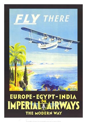
Imperial Airways

A follow-on of sorts to a recent post.

Imperial Airways was Britain's main international airline between 1924 and 1939. It enjoyed semi-official status, as it was subsidised by the British government, and had the contract to deliver air mail throughout the Empire. Another international airline was formed in 1935, British Airways,1 which serviced European routes (and it was apparently subsidised as well, at least for the London-Paris route). Imperial did too, but only it flew the long-distance routes to South Africa, India, Hong Kong, Australia (with help from QANTAS) and points in between. I'm not sure if this was an official monopoly, or just because it was difficult to compete over such long distances without subsidies. I also wonder what would have happened if the Imperial Airship Scheme had gone into operation -- would Imperial have run that too? Anyway, in November 1939, Imperial and British were merged into BOAC, the British Overseas Airways Corporation.
...continue reading

  1. Not the current BA, though they are related. []

1 Comment

[Cross-posted at Revise and Dissent.]

[Image removed at the request of the copyright holder.]

The minute hand of the famous Doomsday Clock of the Bulletin of the Atomic Scientists has just moved closer to apocalypse: it is now set at five minutes to midnight. This is the most dangerous level it has been since 1988. The dangers currenty facing humanity are summarised thus:

The world stands at the brink of a second nuclear age. The United States and Russia remain ready to stage a nuclear attack within minutes, North Korea conducts a nuclear test, and many in the international community worry that Iran plans to acquire the Bomb. Climate change also presents a dire challenge to humanity. Damage to ecosystems is already taking place; flooding, destructive storms, increased drought, and polar ice melt are causing loss of life and property.

Obviously, the precise position is fairly arbitrary -- the relative movement back and forth is more significant, i.e. whether the world is getting more dangerous or not -- but it's interesting to reflect on the past movements of the minute hand:
...continue reading

3 Comments

As promised, here's a revamped version of the speed plot I did the other day, this time distinguishing between biplanes (and triplanes), monoplanes and jets (just the one -- the Meteor). It's now a bit harder to read, though -- it's still red for fighters and blue for bombers, but now biplanes are represented by crosses (of the appropriate colour), monoplanes by open triangles, and jets by filled triangles. Also I noticed that my criteria for inclusion in the dataset had changed part-way through, so I've added a few aircraft to make that consistent (mainly torpedo-bombers) -- I'll update the original post shortly.

Maximum speed of British combat aircraft, 1912-1945

This shows very clearly the big jump that came with the move to monoplanes in the mid-1930s. And not just in fighters -- bomber speeds increased by around 100 mph. In fact, the last British biplane fighters, introduced in 1937, could barely keep up with their own bombers. Again, cubic spline fits to the various combinations illustrate this. (Referring to the left-hand endpoint of each fit, they correspond to biplane fighters, biplane bombers, monoplane fighters and monoplane bombers.)

Maximum speed of British combat aircraft, 1912-1945

Looking at the data again, there is another feature worth remarking upon. Based solely on the number of models entering production (ie, and not on the actual numbers of aircraft that were built), the period up to about 1925 is dominated by fighters, while the period from then up to the start of the Second World War is dominated by bombers. For the 1914-8 period, I think this is explained by the constant battle for air superiority over the Western Front, which saw new fighters rushed into service every few months to counter new German types. But I'm somewhat surprised that there were so many fighter types introduced in the early-to-mid 1920s, given that the bomber orthodoxy was supposedly being established at this time (though some of the fighters were for export or were otherwise speculative ventures, not designed to Air Ministry specifications). For the bombers, the reason would probably be the desire for a heavy bomber as a deterrent, but more so the increasing need for specialised aircraft adapted for different roles, as opposed to the "general purpose" aircraft common in the 1920s.

7 Comments

Last year I was playing with a plotting program for Mac OS X, which was pretty good, but not quite satisfactory. I've found a better one, Plot, which is free (as in beer), fairly easy to use, and very customisable. It has its own idiosyncrasies, but I like it a lot. Here's an example plot, showing how the top speed of British combat increased up to the end of the Second World War.

Maximum speed of British combat aircraft, 1912-1945

The data are drawn from John W. R. Taylor, Combat Aircraft of the World From 1909 to the Present (New York: Paragon, 1979). This excludes aircraft which never saw service as well as those not intended for combat (though not all actually saw combat). The year is that in which it entered service (usually with the RAF), or if this wasn't given, the year when the prototype first flew. (Some aircraft unfortunately had neither, and so were omitted.) The maximum speeds, in miles per hour, are not necessarily comparable, because they were often obtained at different heights; also, they may not have been sustainable under normal conditions. But they should be broadly indicative of real-world maximums. I've classified each aircraft as either fighters (red) or bombers (blue), based upon their actual use. However, that's fairly arbitrary for the period up to 1915, which is when aircraft adapted for specialised roles began to appear. I haven't included seaplanes but I have included carrier-borne aircraft. Generally, I have only included data for the most representative version (eg not for each of the innumerable marks of Spitfire). Because of these caveats and inconsistencies, the plot should not be taken too seriously -- it's just for illustrative purposes.

...continue reading

5 Comments

From the just-because-I-can department.

RAF growth, 1920-39

As an ex-physicist, I like to see numerical data plotted in a graph, as well as in tabular form - it's much easier to visualise what's going on. I don't have any particular need for this right now, but I've been playing around with a few plotting packages anyway. The figure above was made with pro Fit (OS X only), which has a free trial version, limited in the number of graphs, data points, etc, that can be in use at one time. It's easy to use and the end result is pleasing enough to the eye. The main problem I found is that the legend isn't a separate object to the graph, so I can't shift it to make room for a longer axis label. But I like it otherwise, so I think I will stick with it for the moment.

The data itself is taken from the tables in the back of John James, The Paladins: A Social History of the RAF up to the Outbreak of World War II (London and Sydney: Macdonald, 1990) - tables 5 (for the Air Estimates, ie the Air Ministry's, and effectively the RAF's, budget), 9 (UK squadrons only) and 15 (from which I derived the number of squadrons in 1939). A few remarks: the number of squadrons tracks the budget fairly closely. I would have expected there to be a year or two lag, because as James points out, men have to be trained, aircraft orders placed and land for airfields purchased well in advance of a squadron coming into being. I guess the squadrons may not have been effective initially, though. Secondly, despite the deterrence policy of Trenchard's RAF, and the authorisation of 35 bomber to 17 fighter squadrons for the Home Defence Air Force in 1923, there were actually slightly more fighter squadrons than bombers right up to 1935. Finally, the graph shows how weak the RAF was in fighters at the time of Munich in 1938 (and just plotting raw numbers actually understates this, as Fighter Command mostly had obscolescent types at the time).

Addendum: I forgot to mention that James doesn't say if the Air Estimate figures are in adjusted pounds or not - so I assume they are not.