Maps

25 Comments

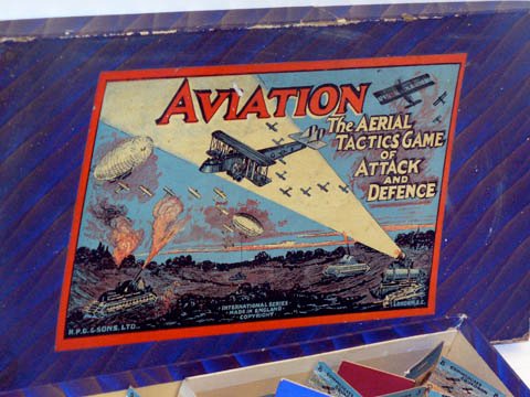
[Cross-posted at Revise and Dissent.]

One interesting minor theme of my recent museum visits here in London has been, I suppose, the popular origins of wargames (as opposed to the intellectual origins): I've been coming across a number of games, produced in the first half of the twentieth century and aimed presumably at children, which represent war in some way. War games, but not yet wargames. So for example, one exhibit in the Science Museum's aviation gallery was a First World War-era board game called Aviation: The Aerial Tactics Game of Attack and Defence. The board represents the sky, and the pieces are aircraft and squadrons. Here's the box:

Aviation

According to the caption, it was published around 1920, and the cover shows 'stylised First World War tanks and Handley Page H.P. 0/400 [sic] bombers'. It doesn't look particularly like an O/400 to me; the corresponding game-piece is just called a Battle Plane (and the "tanks" are actually anti-aircraft guns on tank chassis, very advanced!)
...continue reading

2 Comments

The earliest cite for the word 'airport' in the Oxford English Dictionary is from 1919:

1919 Aerial Age Weekly 14 Apr. 235/1 There is being established at Atlantic City the first 'air port' ever established, the purposes of which are..to provide a municipal aviation field,..to supply an air port for trans-Atlantic liners, whether of the seaplane, land aeroplane or dirigible balloon type.

As is often the case with the OED's cites, earlier ones can be found (though not many, it is true). The following is from March 1914, from a proposal by the Aerial League of the British Empire to decentralise flying by setting up airfields around Britain:

The time will come when, with the development of aviation, every town of any importance will need an air-port as it now needs a railway station.1

Now, it seems pretty obvious that 'airport' was coined by analogy with the much older word 'seaport', just like 'air power' and 'sea power'. I don't doubt that this is mostly true, but there is another possibility too. The word 'air-port' (with hyphen) did in fact exist before the coming of flight: it referred to a hole for ventilation, especially on a ship or in an engine -- what today might be called an air intake or outlet. I'll come back to this in a moment.
...continue reading

  1. The Times, 16 March 1914, p. 5. Emphasis added. []

9 Comments

This is my third post about maps out of the last four, so I've given in and made a Maps category. It's not just me: there are another three posts about maps at Breathing History, and also at Philobiblon and My London Your London about an exhibition at the British Library about maps of London. And then The War Room alerted me to a great blog called strange maps, the subject of which is just what it sounds like -- fascinating and unusual maps of all kinds: historical, fictional, satirical, political. There are three Second World War era maps produced for propaganda purposes: one supposedly showing German war aims, another supposedly showing Allied war aims, and one especially interesting to me, supposedly showing a 1934 German map of a supposed aerial threat from Czechoslovakia:

Czech air menace, 1934

The provenance of the map is not clear -- it's labelled in German 'A small state threatens Germany', but under that is another label in English explaining that it was 'published in Germany in 1934 to create fear of Czech bombing', so who knows when or where it was published in English, or even if it was ever actually published in German. My guesses would be 1938-40, a British newspaper, and yes, but the online source doesn't say. Anyway, plotting the range of aircraft in order to demonstrate the threat of bombing was common enough by this time, as I've previously discussed.

There's no doubt that Germans in the 1930s lived under the shadow of the bomber: by 1934, the Nazi-founded Reich Civil Defence League already had 2.5 million members, and the prospect of morale bombing would have been especially disturbing to believers in the Dolchstoss legend, that Germany had not been defeated in the field in 1918 but "stabbed in the back" by weak-willed civilians. Hitler described Czechoslovakia as a dagger aimed at the heart of Germany. But Czechoslovakia never came close to bombing Germany; instead it was Goering who threatened the aerial destruction of Prague, to make sure that Czechoslovakian forces didn't resist the illegal German occupation of Bohemia and Moravia in March 1939 (sorry, I mean the liberation of Slovakia). Assuming it is actually genuine, this map would have been one small justification for the progressive German campaign against the Czechs.

26 Comments

Note: This map DOES NOT show real air routes, from 1920 or any other year! They are purely imaginary.

While writing the post on old maps, I happened upon the following example, which is labelled 'The world -- principal air routes' and dated to 1920 by the host site, Hipkiss' Scanned Old Maps:

Principal air routes, 1920

The only other information given is that it is from The People's Atlas and produced by the London Geographical Institute.

Now, this is interesting, because it most certainly does NOT show air routes in 1920: there were very, very few, and they certainly didn't criss-cross the world as this map suggests. Many of these routes had not been flown at all, let alone by regularly scheduled services. For example, here's a close-up of the North Atlantic:
...continue reading

1 Comment

New Popular Edition Maps is an attempt to produce a copyright-free database of British postcodes. It does this by asking people to hunt around on a clickable, zoomable map of the UK for places for which they know the postcode (e.g. their home), and then enter that postcode at that spot. It's a bit like a stripped-down Google Maps; and you can search the map by placename or postcode. But what's interesting about this is that the maps used are out-of-copyright Ordnance Survey maps (1 mile to the inch) from the 1940s and early 1950s, which could be useful for historians or teachers, though these are obviously not the intended audience. Unfortunately Northern Ireland and most of Scotland is missing. (The National Library of Scotland has the OS maps of Scotland from the 1920s.)

Finding this inspired me to do a bit of a search for other online historical maps of Britain which similarly attempt to cover the whole country. (There's a useful list of out-of-copyright maps here.) Old-maps.co.uk has been around a while and uses OS maps from the late 19th century. Vision of Britain (which site has lots of historical statistics which you can slice various ways, and which I must explore more thoroughly one day) is more sophisticated, and has a neat trick of switching between different maps depending upon the zoom level: for example going from a 1921 large-scale map to a 1904 OS one to a NPE map. It also has 19th-century maps and a 1930s land utilisation map. But possibly the most interesting is Old Ordnance Survey Maps, which is based upon OS maps from the 1910s, 1920s, 1930s and 1940s. The coverage is very much incomplete; but it uses the Google Maps API, which means that it has a familiar interface for users, and could be used for mashups. It already overlays the regular Google Maps satellite and street maps. There are also handy links to take you to the same location at old-maps.co.uk and Vision of Britain. I can think of some improvements (for example, printing the publication date on each map) but this approach has tremendous potential.

14 Comments

Japanese ARP poster - bomber ranges

In my previous post I talked about some Japanese ARP posters from 1938. One in particular (above; click for larger version) is very revealing: it shows exactly whose bombers the Japanese were worried about, by plotting circles on a map of Japan and its neighbours, representing the radius of actionNo more than half the maximum range of an aircraft, assuming they return to the base from which they took off. of bombers from potential enemies. It turns out they were afraid of everybody's, except for the country they were actually at war with (China). The brown circle shows the radius of action of American bombers from the Philippines; black, British bombers from Hong Kong; green, Russian bombers from Vladivostok; yellow, American bombers from Alaska; and blue is in the middle of the ocean -- American carrier-borne bombers, most likely. The circles are marked with a number, probably a distance: 2000 km? That would make some sense, as it was very roughly the radius of action of the B-17s that were just entering service in the US Army in 1938 (though not in substantial numbers until 1941).

This sort of map is quite common these days, particularly in highlighting the danger from rogue states. For example, here's one centred on North Korea, from a website criticising Clinton's foreign policy:

North Korea - missile ranges

The circles here are not the radii of action of bombers, of course, but the ranges of missiles.As missiles don't return to base, their radius of action is equal to their range. But the principle is the same. There's a subtle difference, though: the Japanese one projects a defensive outlook: it shows the circles encroaching on Japanese territory and so emphasizes how vulnerable Japan is. The North Korean map, on the other, does not highlight the threat to any particular country, but instead demonstrates how North Korean missiles threaten all of its neighbours -- that is to say, just how rogueish a state it is.

Here's another missile-era map, this time quite an historic one from the Cuban missile crisis in 1962 (looks like it was drawn up by the CIA). This is more like the Japanese map: though the threat is from Cuba, the centre of the map is shifted towards the United States, to show just how much of the country would fall under the shadow of Soviet missiles (but by the same token, de-emphasising the threat to South America).

Cuba - missile ranges

I haven't come across many other pre-Second World War examples, though I'm sure they exist. The only other one I currently know of is British, and is very early, dating from 1913:

Germany - airship ranges

This time it's not bombers or missiles that are the threat, but Zeppelins. (Love that OTT title!) The map is centred on Heligoland, which another map in the same magazine claimed was the site of an airship station. The caption says that the outer circle (600 miles) represents the radius for Zeppelins; the 300 mile circle is for aeroplanes. It 'should bring home to every patriot the vital necessity of Britain putting her house in order forthwith, by the grant of adequate provision in the nation's Estimates to enable us to make up the heavy leeway from which this country already suffers'. Indeed it should; those circles are very dark, aren't they? Though that might just be the poor quality of my photocopy ...

Image sources: National Archives of Japan; Clinton Foreign Policy Page; John F. Kennedy Library; Flight, 1 March 1913, 248.

Aside from the whole shadow-of-the-bomber thing, I have an amateur (okay - more amateur, then) interest in the Cold War and the fear of nuclear war. Partly because of the obvious continuities and parallels with the area I'm studying, but also because I'm old enough to remember the last flowering of nuclear paranoia in the 1980s. Anyway, from time to time I may post items on the subject. Here's one: a map of the continental US showing the probable radiation exposure from a full-scale Soviet nuclear strike.Jonas Siegel, "The original nuclear nightmare", Bulletin of the Atomic Scientists, September/October 2005, 38-9. It's based on data compiled in 1986 by FEMA, and it would hardly have been comforting for policymakers - the 'low risk' areas in yellow represent an estimated exposure in a week of up to 3000 roentgens for unprotected persons, which would still kill many people and leave many more very sick. It looks like it was assumed that the Soviets were following a counterforce strategy - most of the heavily populated regions seem relatively unscathed (though you can say goodbye to Hollywood), and the main targets would seem to be in Montana and the Midwest, where most of the ICBM silos were.

1980s pop cultural landmarks of note: Lawrence, Kansas, was definitely in danger, in the high risk zone sandwiched between two very high risk zones. Goose Island, Oregon, doesn't exist, but it doesn't look like it could have been 'just three miles from a primary target' as the prof claimed. Calumet, Colorado, also doesn't exist, but would have been at low risk - go Wolverines! And Cheyenne Mountain, Colorado, unsurprisingly appears to be in a high risk zone, but they wouldn't have been too worried about that, would they.