

A tweet from William J. Turkel alerted me to the possibility of using 18th century-style fonts in LaTeX. The most noticeable difference from modern typesetting is the long s, but there are different ligatures too. There are a number of ways to do it but the easiest way is with the inbuilt Kepler Fonts package. (The Fell Types are far prettier, but look difficult, or at least tedious, to install. Font management is one of LaTeX’s biggest weaknesses.) Just insert the following in your preamble and you’re done:
\usepackage[fullveryoldstyle]{kpfonts}
Well, almost. This simply replaces every s with a long s, which is not right. Most importantly, long s is generally not used at the end of a word, so you need to replace these with ‘s=’. Here’s what the first paragraph of my thesis looks like when done this way:
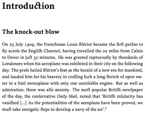
I wish I’d known about this before submitting it.
![]() This work is licensed under a Creative Commons Attribution-NonCommercial-NoDerivatives 4.0 International License.
Permissions beyond the scope of this license may be available at http://airminded.org/copyright/.
This work is licensed under a Creative Commons Attribution-NonCommercial-NoDerivatives 4.0 International License.
Permissions beyond the scope of this license may be available at http://airminded.org/copyright/.
Wow. I went into this assuming that you were misusing the long s, Brad, since as I recalled, the rule is that only the first “s” in a double “s” is elongated, corresponding to the German Eszett. But then I went to Wikipedia, and, well, take it away, Wikipedia Germanists. That led me to the actual rules for the long s, and it looks like the one I’m vaguely recalling might have (vaguely) applied in my period.
And it survives today in linguistics to indicate the “voiceless postalveolar fricative.” I’m going to say that today, just to look smart.
The other place that the long “s” survives (familiar to many LaTeX users, no doubt) is the “integral sign”. I was told, in undergraduate math class, that it’s basically “S for sum”, denoting the smooth infinite-resolution limit of the Reimann sum. This also provides a nice mnemonic contrast to the angular capital greek sigma used to denote discrete sum rules.
I have no idea if this reflects the actual history of the sign or not.
Erik:
I wouldn’t be at all surprised to find I’d got it wrong. In particular, ‘croffing’ looks wrong — since cross would be ‘crofs’ then shouldn’t it be ‘crofsing’? But I couldn’t find a rule for that situation.
UG:
Yes, I remember being told that too.