My book, The Next War in the Air: Britain’s Fear of the Bomber, 1908-1941, is getting closer to being real. In June, in just three months, it will be in the bookstores. Soon the indexing will be undertaken. Yesterday I made the final corrections to the text, and shortly I’ll receive the page proofs from Ashgate, for last-minute error checking. And it has a draft cover design! Which I must say I am rather pleased with.
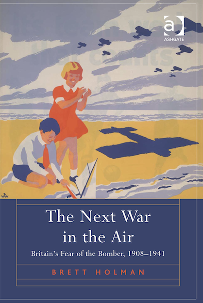
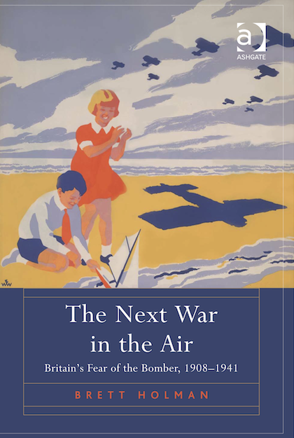
This is the basis for the design (coincidentally, from Getty Images). I’ve discussed it here before, which is why I thought of it. It’s a National Government poster from the 1935 general election, and in many ways it’s the perfect image for my book. It shows civilians threatened by aerial warfare, with a literal shadow of the bomber falling across them. It is from peacetime, not from wartime; from 1935, when the fear of bombing was almost at its height. And it’s a propagandistic use of that fear for political ends. Keep that shadow from them. Vote National.
Of course, if a book cover needs to be explained, then it has already failed. I did worry that despite illustrating so many themes from the book that this poster might not speak for itself. Would people get that these are children playing on a beach, who are unknowingly being threatened by bombers flying overhead? Would it make sense as a bare image, or would it need the poster text as well, to get the context across? I wasn’t sure. But what I didn’t realise is that the presence of the book title itself is enough to tell the viewer that these aeroplanes are military and menacing. At least I think so!
The only thing I don’t like about this cover is the image that can be seen bleeding through from behind, which is another, non-aerial poster from the 1935 general election. As you can see, the bleed-through is the result of the way these posters have been preserved by the Conservative Party Archive, bound together in a big volume. Unfortunately, this was the only version of the poster I could find (though I now see that the Hoover Institution has a copy too, and a cleaner one at that). There’s probably not much that can be done about the bleed-through, short of savaging the image with Photoshop. Anyway, the cover gets the message across — which is buy my book!
![]() This work is licensed under a Creative Commons Attribution-NonCommercial-NoDerivatives 4.0 International License.
Permissions beyond the scope of this license may be available at http://airminded.org/copyright/.
This work is licensed under a Creative Commons Attribution-NonCommercial-NoDerivatives 4.0 International License.
Permissions beyond the scope of this license may be available at http://airminded.org/copyright/.


Those were the days, when a chap wore a shirt and tie for a day at the beach! Seriously, a nice cover, that works perfectly with the theme of the book.
At least the poor kid got to wear shorts, I guess! And thanks.
Congratulations on the excellent cover, Brett.
I am always getting complimented for the choice of cover of my book, which is gratifying but also a little embarrassing because I had nothing to do with creating it whatsoever. I had a completely different picture in mind. Fortunately, publishers don’t pay much attention to the foolish ideas of mere authors.
And the children are playing with a sailboat, of course. Looking back, looking back…
I really like the cover and the concept.
I don’t think that you need to ‘savage’ the bleedthrough with Photoshop. There seem to be big blocks of colour and clear boundaries between them, so a little manipulation with the clone tool would clear things up quickly.
Here’s another vote for the cover. Lucky for you that Uri Bialer didn’t get to it first!
It’s unmistakably 1930s and so it fixes the viewer’s/potential reader’s thoughts on that decade. But at the same time (and despite the subject of the book) it doesn’t immediately yell out ‘gloom and doom’ which is pretty much a standard text for the 1930s when seen in retrospect.
Like Kym, I think it would be worth trying to clean it up. It surely wouldn’t be too difficult to make a convincing job?
Glad to see the reactions are positive! Hopefully the text will meet the level set by the cover…
Alan:
And it is very good cover! Interesting that your publishers went with their own idea; mine were happy to go along with my suggestion (I mentioned a few others to them, but this was my favourite). Though maybe if they hadn’t liked it too they would have just ignored me, and gone with something else or even a plain cover. Also, the photograph on Demobbed‘s cover has very obviously been manipulated, so some publishers at least are willing to go to some lengths to make the cover look right (though I suspect Yale sells many more books through actual bookshops than Ashgate does).
Erik:
Stupid kids. If only they’d been more airminded!
Kym:
I’m sure it can be done. I’ve pointed out the bleedthrough to Ashgate and asked if it can be fixed, but haven’t heard back yet.
Neil:
Yes, it would been easy to go with a photo of bombed out houses, or Zeppelins or Heinkels or something. This is a bit different but also very apt. Another thing I like, incidentally, is that the aeroplanes are biplanes rather than monoplanes, as most people would associate with bombing; it might give readers a bit of that retronautical feeling.